Brand Guidelines
Welcome to the ECS Brand Guidelines, a digital tool created to help make it easier to maintain the brand.
Here you'll find the foundational elements that create the ECS brand identity. Consistency is key in keeping the brand presence strong. Consistent and repetitive usage of these elements will create lasting recognition and a memorable connection with our audience.
Using Guidelines
For over a century, Episcopal Communities & Services (ECS) has provided sophisticated, maintenance-free, and proactive wellness living for discerning adults. Each senior living community has been created to ensure the next chapter of life is as rich and vibrant as our residents. In this brand guideline you’ll find the foundational elements and tools needed to help express the brand authentically. We’re all brand advocates and consistent application is the key to creating brand trust and loyalty.
So, dive in and explore how the ECS brand brings the art of possibility to life.
Brand Foundation
Brand is the way a company is perceived by those who experience it. Much more than a name or logo, a brand is a recognizable feeling derived from the core truth of the company. You can’t hold it or hear it or even touch it. Brands live in the minds of the people who experience them: staff, care partners, benefactors, and, most importantly, prospective and current residents and their families.
Essence
The ECS Brand Essence is the soul of our brand. It’s the “why” behind what we do and the driving force of the brand expression. We believe there’s nothing more empowering than crafting life the way you want it. Every step of life’s journey is a unique opportunity to reignite the future with hope and confidence.
The Art of Possibility
Promise
The Brand Promise is the experience our customers can expect every time they interact with one of us or with an expression of the brand itself.
At ECS life’s journey can be as adventurous or easy-going as you want it to be. Open the door to a life full of possibility, and find the choices you deserve, the freedoms you desire, and the flexibility you can count on. Keep your edge, stay active, and create the future you want— because life is what you make it.
We open the door to a life full of possibility.
Mission
For a century, we’ve remained committed to the work we do each day. Residents can feel proud of where they live, and their families can trust in the experience we create for their loved ones. Our team is inspired in their roles. And together, through outreach and volunteerism, we expand what’s possible in the greater community we serve.
We create exceptional communities and services for seniors.
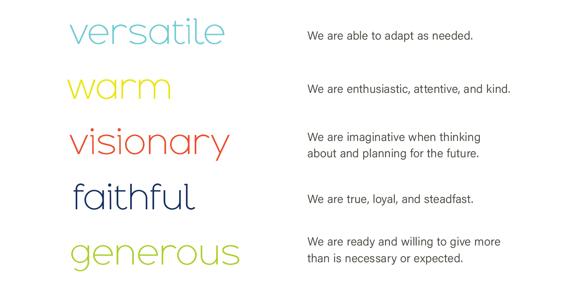
Values
The brand values are the core beliefs that we stand for. Team members live these values, are recognized for reflecting them, and when decisions need to be made, refer to them often.
Persona
Just like each one of us, the brand is defined by a set of relatable characteristics called Brand Persona. When evaluating whether a communication is on-brand ask yourself if it evokes the ECS Brand Persona.
Pillars
Derived from the brand promise, pillars help make the ECS brand memorable and relatable. These four concepts represent how we deliver on our promise.
choice:
creativity:
We go above and beyond, paying attention to every detail, to create a colorful experience that brings out the best in you.
confidence:
You can count on the support, services, and independence you seek, no matter where you are in your journey.
connection:
Whether it’s caring for your physical, intellectual, spiritual, emotional, or social wellbeing, we make sure you feel right at home.
Messaging
As brand advocates, our collective goal is to ensure consistency of expression when conveying the mission, values, and benefits of ECS. It’s about how we write, not what we write — and about why we’re committed to delivering a distinct and memorable experience for our audience.
Tagline
Our tagline acts as a verbal logo. It tells people our “why” simply and memorably. And for us, our tagline is best expressed as our Brand Essence.
The Art of Possibility
Voice & Tone
To make a deeper connection with our audience, we will speak to them as if they are sitting directly in front of us. It helps move the conversation from “we” to “you” and “our” to “your.” When we communicate our Brand Voice and Tone should sound like this:
Key Messages
It’s the strong reasons-to-believe that will resonate emotionally with our audience and build long lasting brand loyalty. Focus on these key messages aligned to our Brand Pillars:
Logo Marks
The ECS brand mark is designed as a metaphor for hope and possibility. The butterfly is intentionally expressionistic, leaving the emotional interpretation of the mark open to the viewer. The ECS type is customized to appear modern, approachable and easily legible.
Primary Logos
The logo is often seen as the face of the brand identity and is used in multiple formats. The ECS logo is the Primary Logo for preferred use.
Secondary Logos
The Secondary Logos spell out the full name and can be used when awareness of Episcopal Communities & Services has been strongly established, and placing the name in accompanying body copy is not possible.
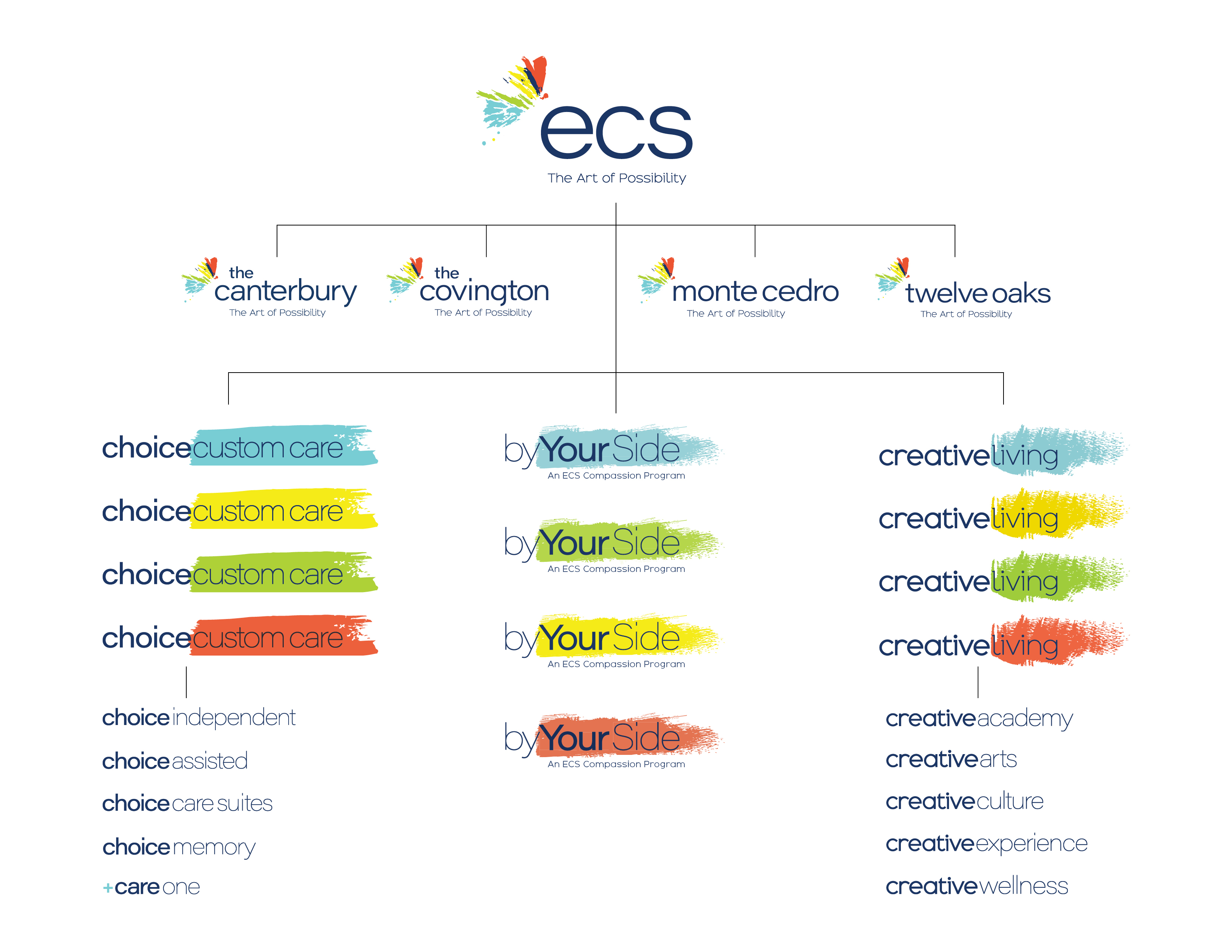
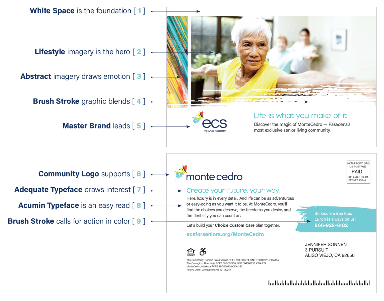
Community Logos
Use community logos when marketing specifically about a unique location and its service offering, or in location specific branding such as building signage or give-a-ways.
Care Level Logos
ECS levels of care now fold up under one umbrella service brand Choice Custom Care. When using this service mark alternate color options whenever possible.
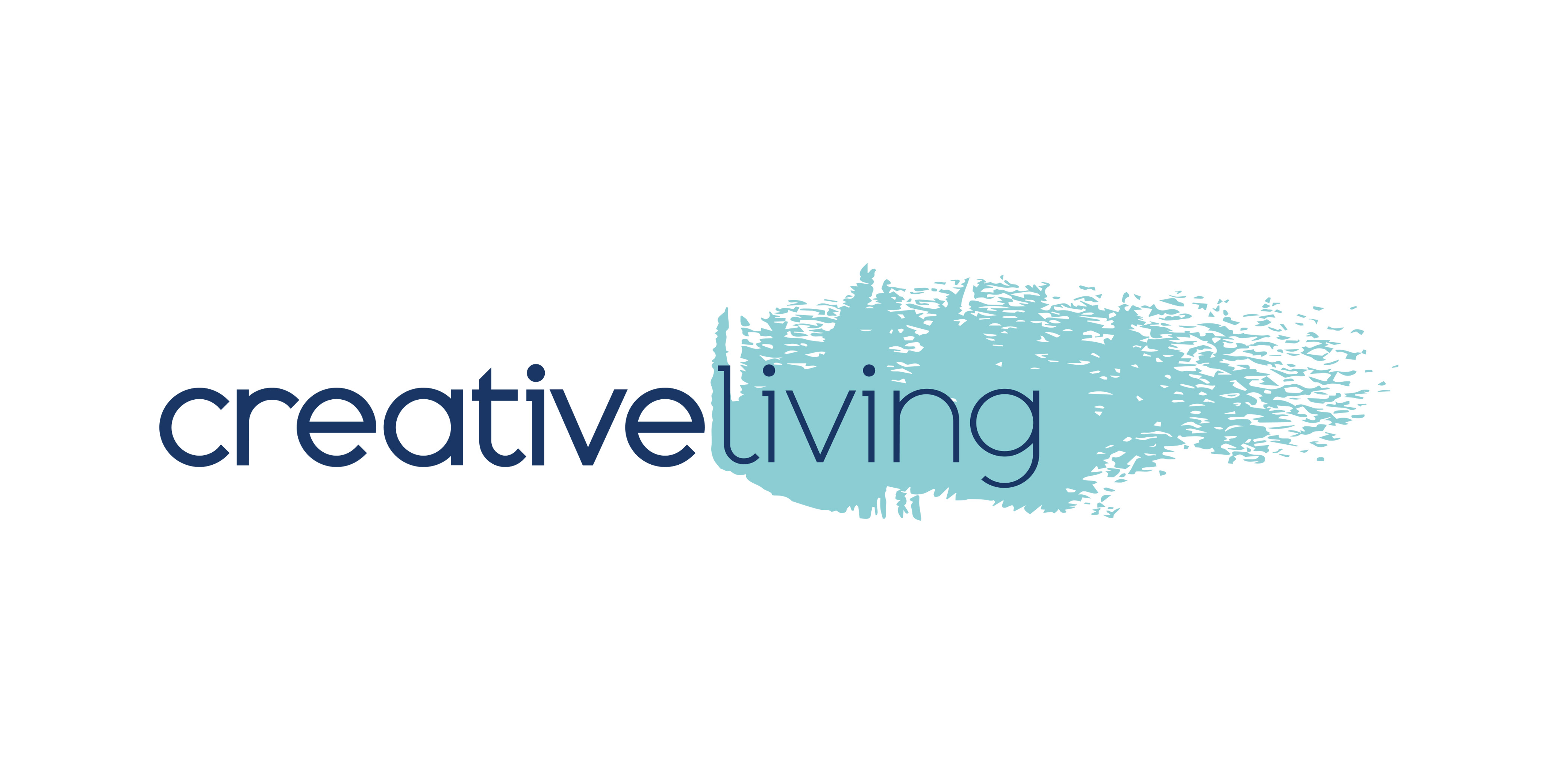
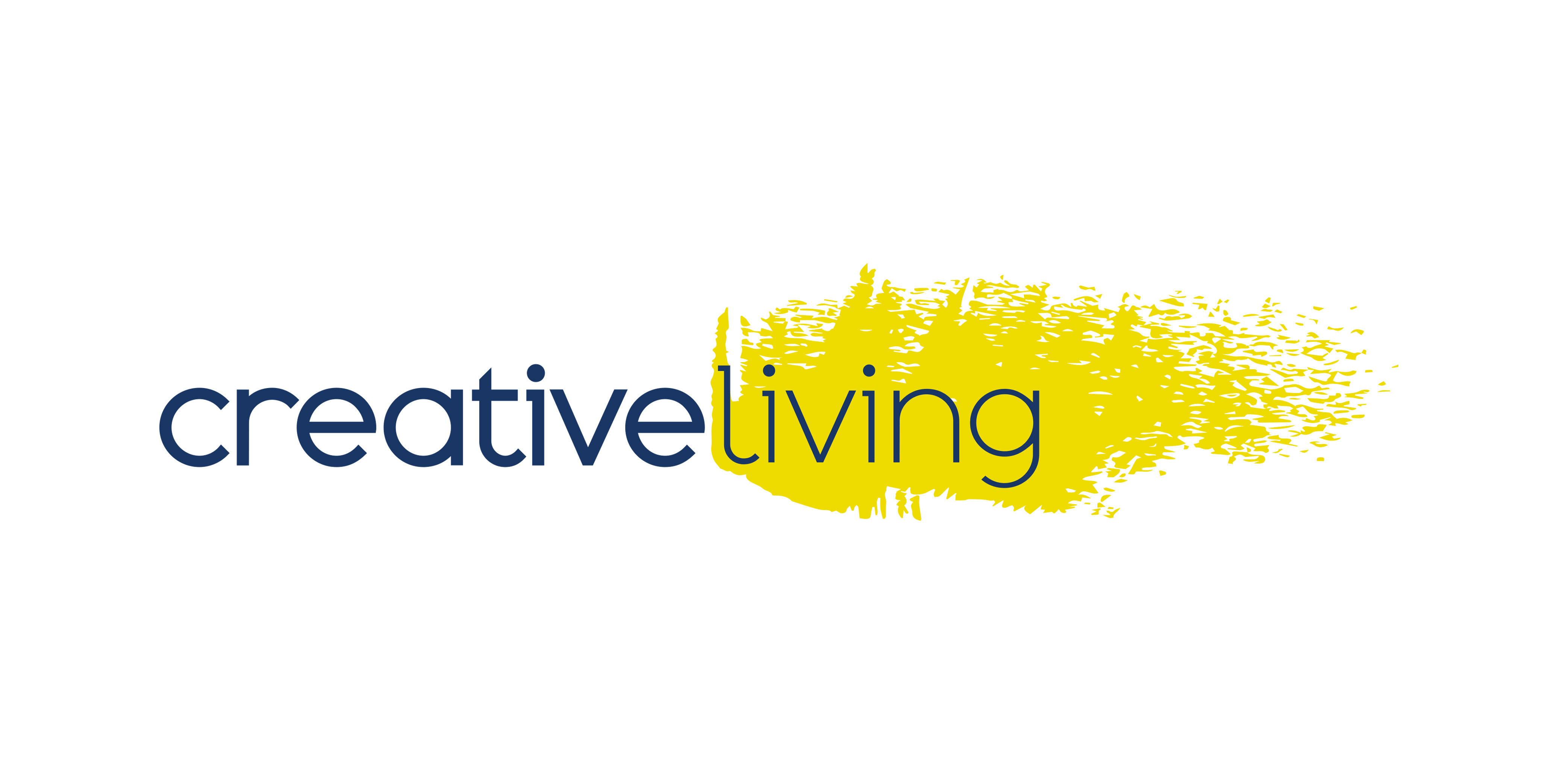
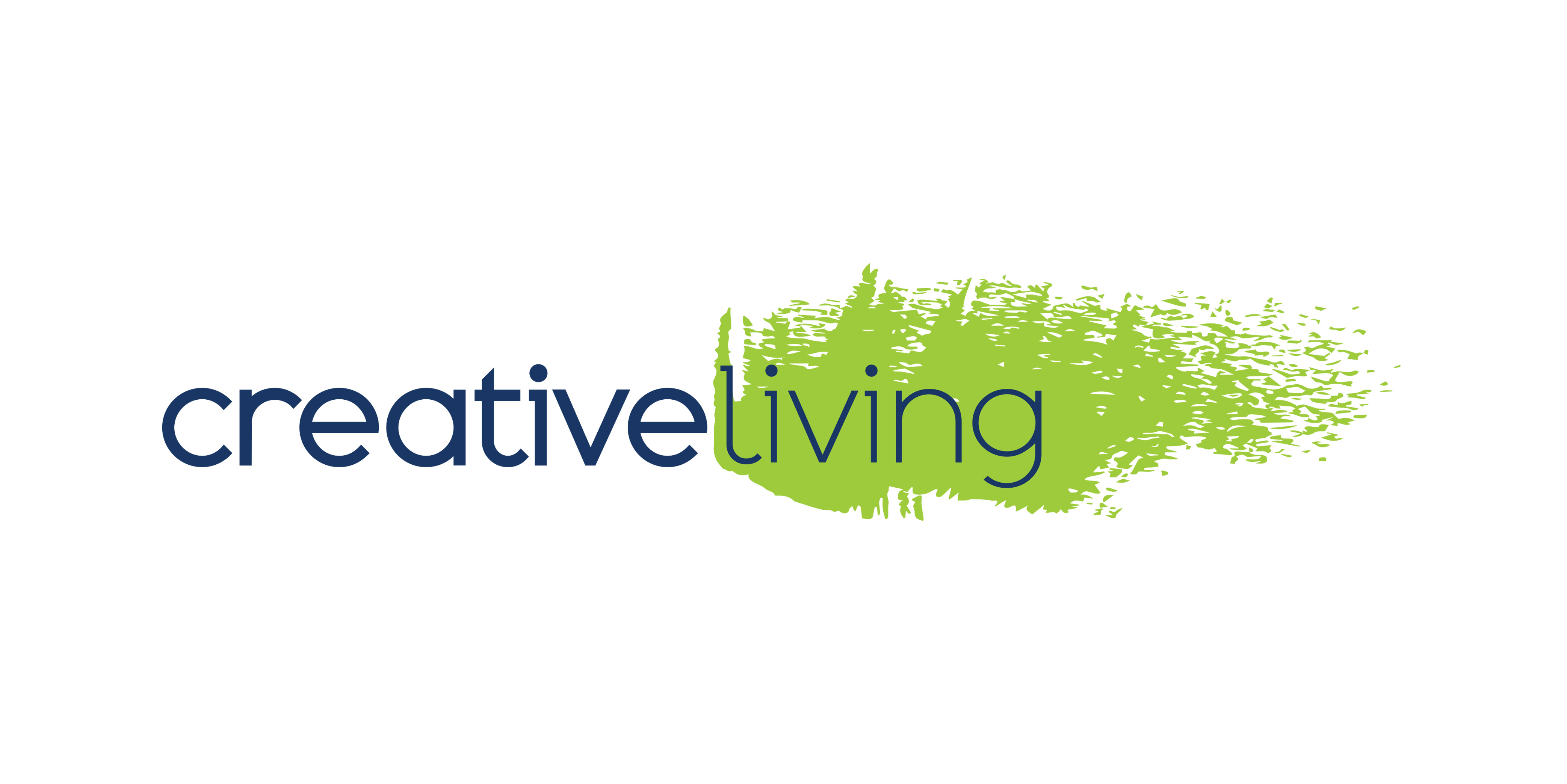
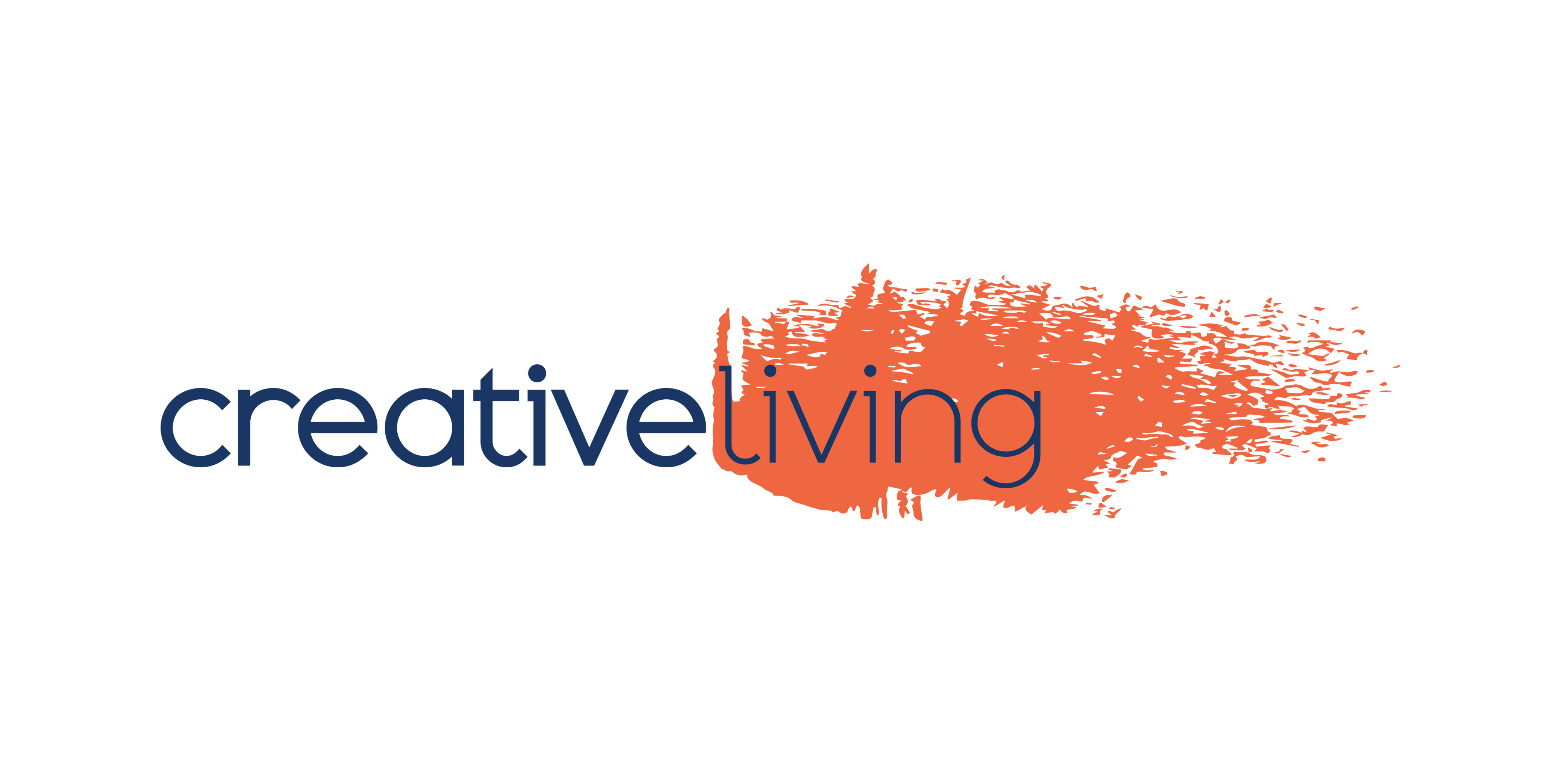
Creative Living Logos
ECS activities live under one umbrella service brand called Creative Living. When using this service mark alternate color options whenever possible, and avoid color coding by community location.
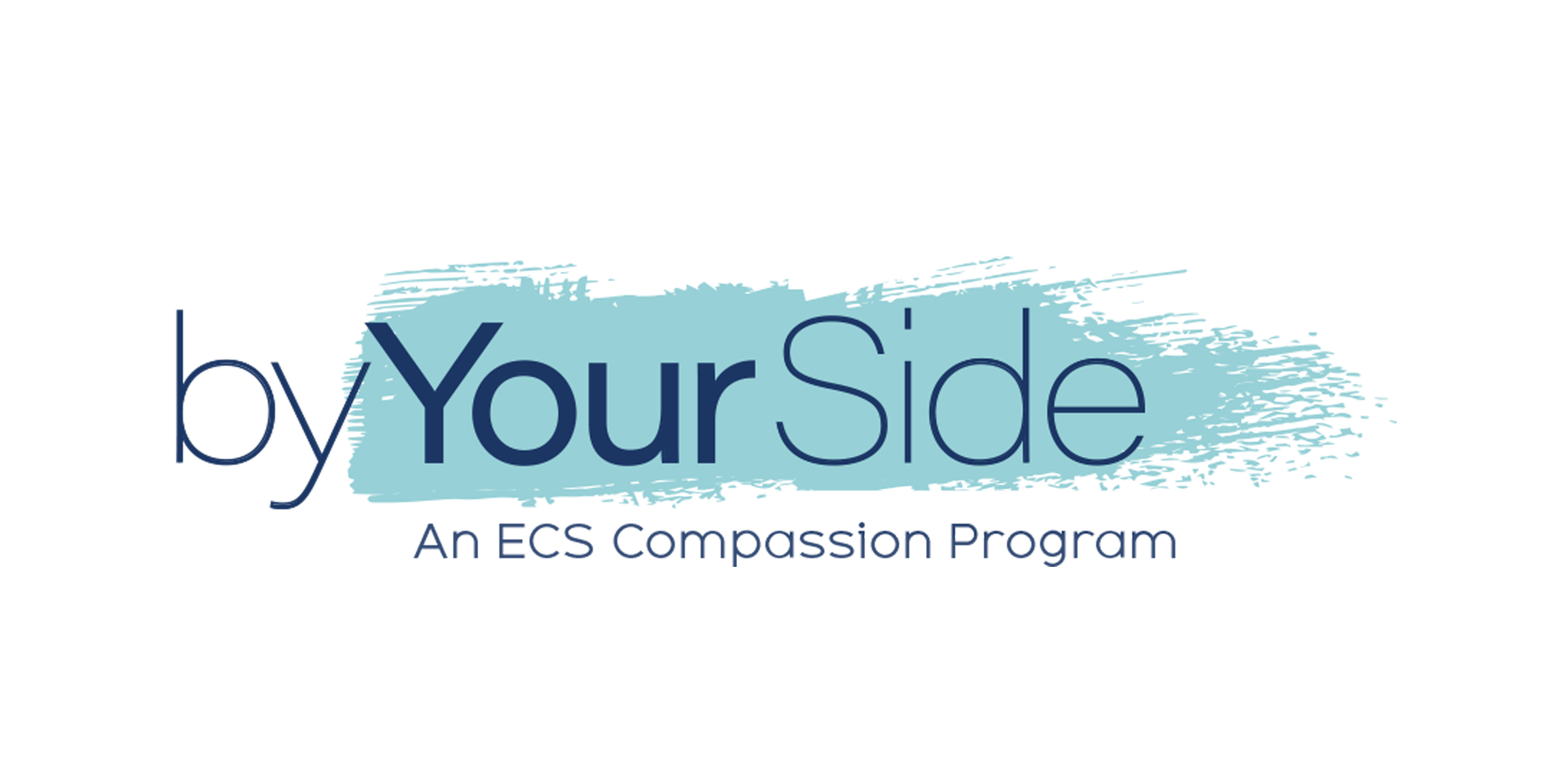
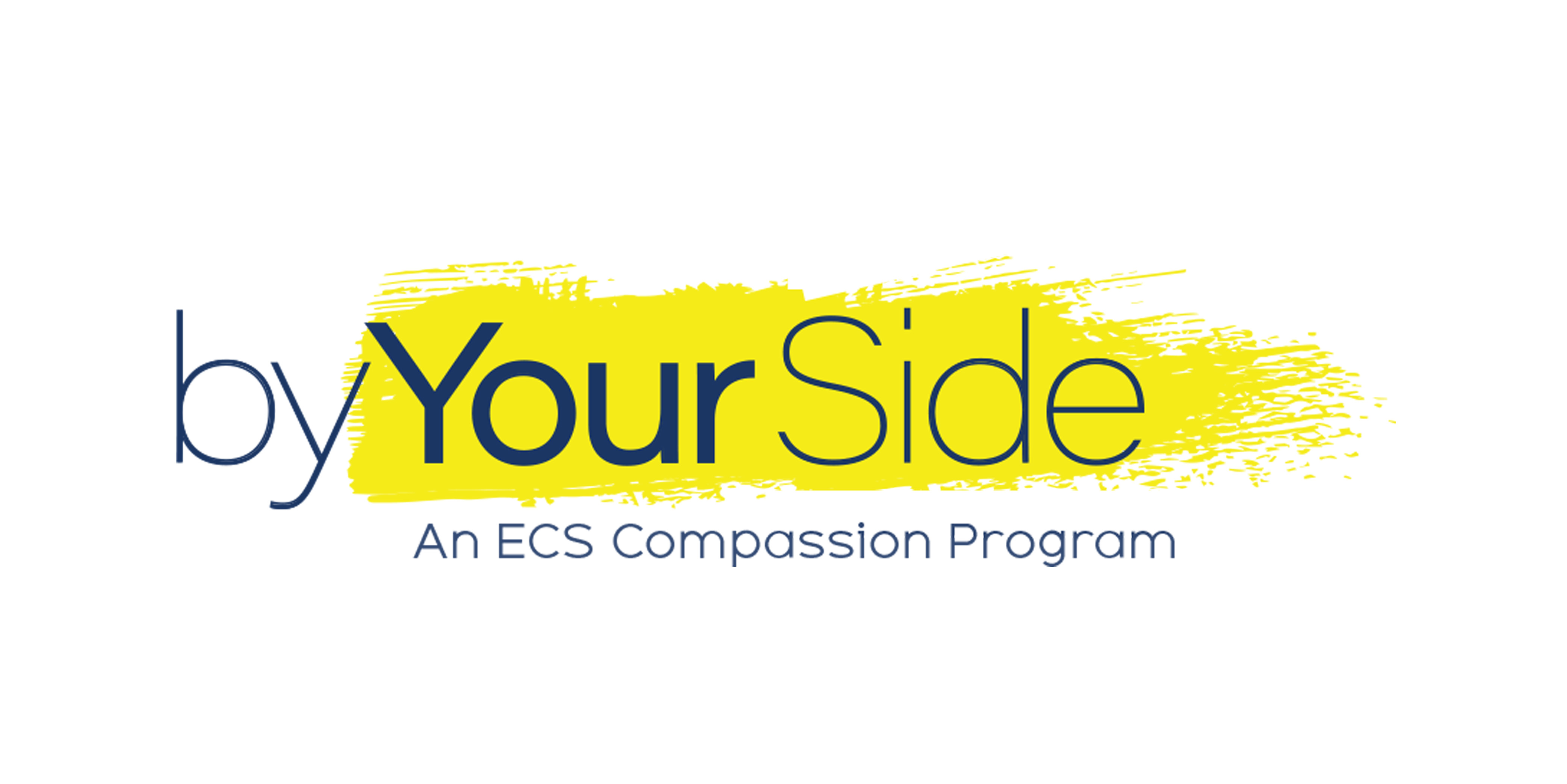
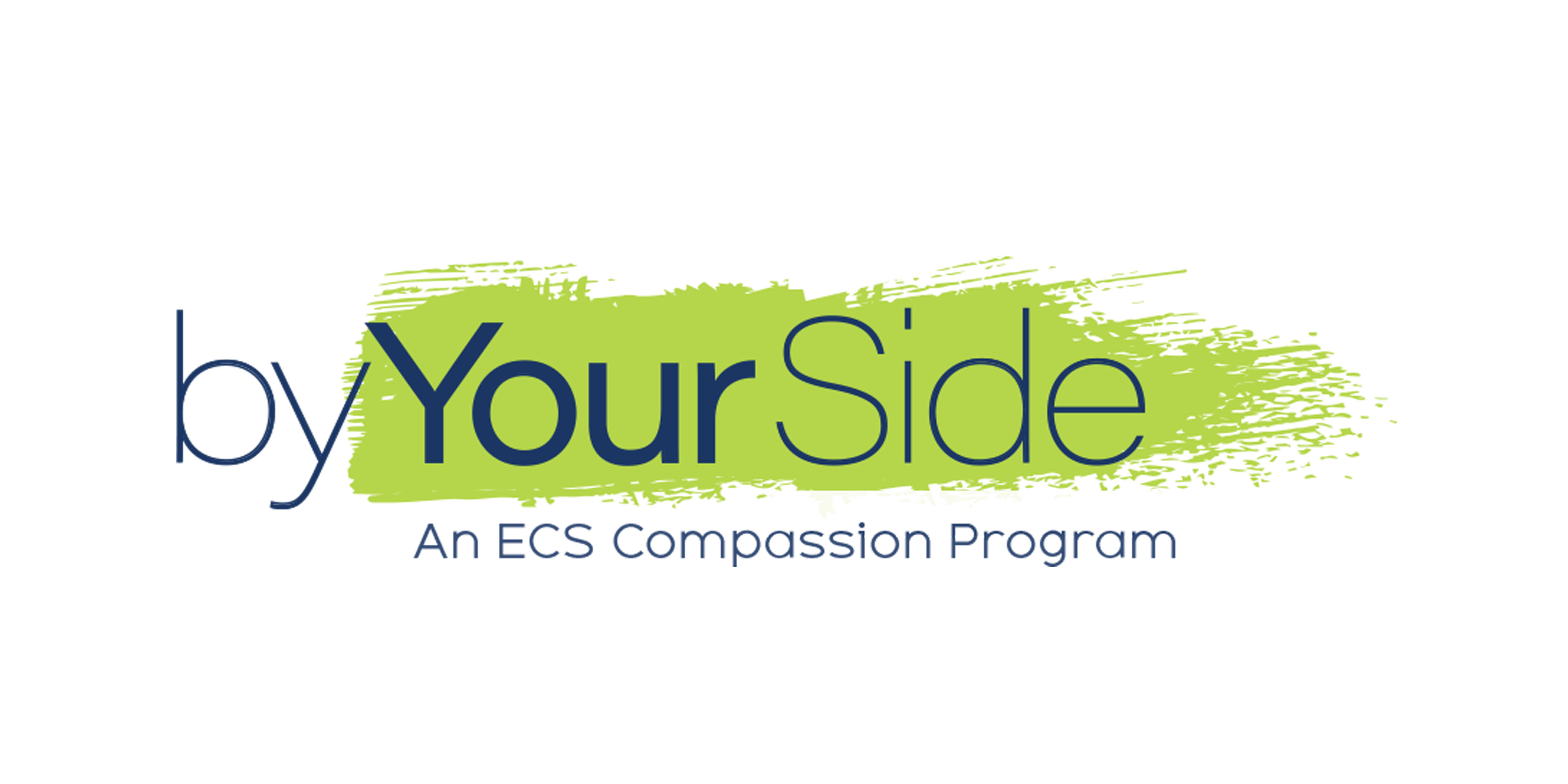
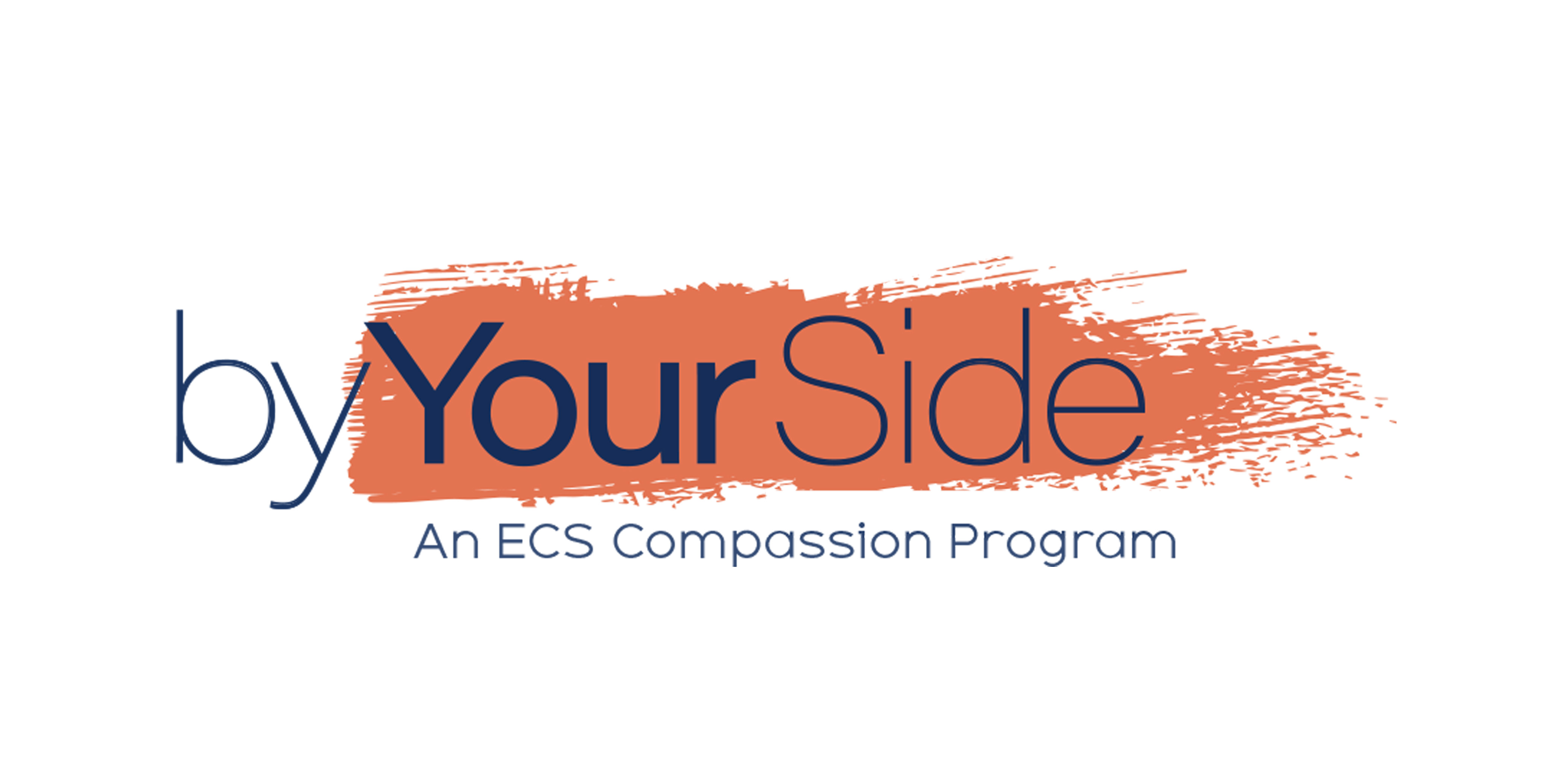
By Your Side Logos
In addition to services ECS offers a program brand called By-Your-Side. This compassion program is similar in brand architecture to Creative Living. When using this service mark alternate color options whenever possible, and avoid color coding by community location.
Brand architecture
The ECS Brand is made up of community locations, service brands and programatic brands. These brand operate as a family of brands within an Endorsed Brand Architecture model. Within this model the master brand, ECS, and the Community brands share the butterfly as a graphic element. In order for these brands to remain distinct, own-able and easily recognizable, the butterfly is not to be used on any product, service or programmatic brand mark.
Brand Dos
Brand Don'ts
Color
The ECS Brand Color Palette was selected purposefully to communicate the Brand Persona. The exact hues, darkness value and tonal range work together to capture attention and evoke an emotional response. The colors are designed to be used together with blue and white being used the most and the brighter colors used as accent. Please refer to the color extension sample for a better understanding of how to combine the colors. Color coding per location is no longer an expression of the brand. All colors are available to all locations for use.
Primary Color
Use the primary color palette first as key indicators of the brand.
Secondary Color
The secondary palette colors are accent colors to be used for vibrancy and contrast.
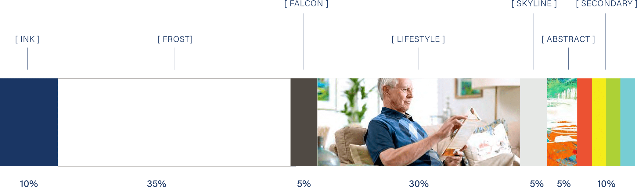
Color Extension
This color extension scale demonstrates the approximate percentages of color used within a single communication. For example, this multi-page brand book applies this percentage guide to the total piece and not to one single page.
Type
The brand fonts are purposeful, easily legible and supportive of our brand values and personality.
Primary / Acumin
Acumin is a versatile sans-serif typeface, designed for balance and extended application in small to large sizes. Use this type family with its varying weights for body copy, subheads, and call-outs.

Secondary / Adequate
Adequate is a modern geometric sans serif with a tall x-height for clarity and legibility. Use the light weight for headlines, quotes, large emphasis messaging and type as graphics.
Tertiary / Arial
Arial is a widely used sans-serif typeface available on most systems. Use this type family for digital assets and internal documents or presentations when brand fonts are not available..

Imagery
The image library is a key component of the brand expression. This unique sets of images are used to highlight the brand experience with open space, exaggerated contrast and pops of color. Use these imagery sets in place of stock photography whenever possible.
Primary / Lifestyle
This Lifestyle image library has been captured using actual ECS residents, environments and staff. These images have been color-enhanced to evoke the brand persona. Use these as your first-choice images.


Secondary / Abstract
These images are used to demonstrate choice, adventure, imagination and to reinforce personal expression. There are nine abstract images available as secondary support imagery. Use these in conjunction with Lifestyle imagery or solid brand color fields. Never use abstract imagery alone.


Tertiary / Brush Stroke
There are four brush stroke graphics available to be used as texture. Layer these graphics to blend primary and secondary imagery into white space or backgrounds — eliminating boundaries. Brush strokes can also be used in color as a flag style call-out.


Expression
The brand expression is made up of all the ways you can experience the ECS brand, from our logo mark to the website — or simply the way we say "hello." Think about the light streaming in through the windows when you enter a community, or the smell of the flowers planted near your favorite walking path. Each of these contribute to the overall perception of the brand.
The following visual is a reference to be used when combining elements, such as color, type and imagery, into tangible communications.
Download
For questions on brand expression or messaging framework email brandQs@ecsforseniors.org.